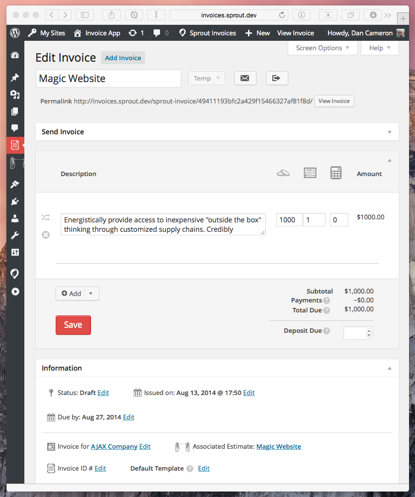
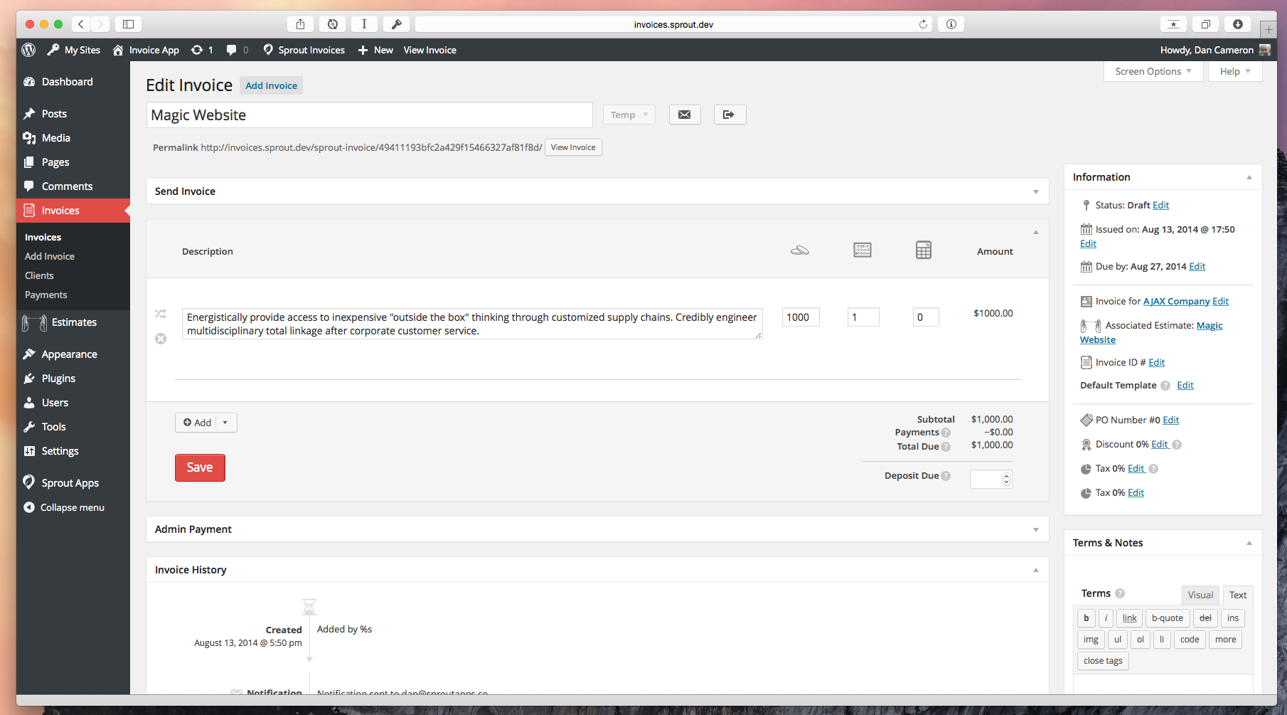
When I started building the UI for Sprout Invoices I felt the default double column view was a bit too cramped for managing estimates and invoices with a lot of line items. This resulted in the default single column view 1.
Below is the single column view that Sprout Invoices will default, regardless of your column settings for any other post type.

However, many miss the option to switch to double column under screen options. A view that is ideal for larger screens.

If you’re familiar with how WordPress allows for meta boxes to be collapsed and rearranged this might not be a surprise but for those not familiar checkout how you can customize the admin UI to your needs.
Note: Any praise for this feature should to those fine folks that make WordPress happen, we just try to do things the WordPress way and sweet things like this can happen.
